“I have a plugin,” says you, “how do I make it Gutenberg-ready?”
The story is straightforward; Gutenberg is the new editor experience in WordPress, which is going to be merged into core in the next major release. A lot of plugins that do not keep up with this will become obsolete. This makes it essential that you adapt your plugin for Gutenberg before it’s too late.
Who’s affected?
Almost all the plugins that have anything to do with the post editor will be affected by Gutenberg. For example, if your plugin adds a button in TinyMCE to then place a shortcode in the editor, bad news; it will be the end of it.

“Do I need to adapt my plugins for Gutenberg?”
So which plugins need updating for Gutenberg? Any plugins that work with:
- Custom metaboxes
- Shortcodes
- TinyMCE buttons
- or any editor feature at all
If your plugin fits in the above categories, it might be time to build a feature request system because while some plugins will still work with Gutenberg, like a plugin that adds a simple metabox, for instance, it will not be as smooth an experience for your users.
Even shortcodes will keep working as before, but it will just be plain text node in the editor, while all the shortcode plugins for Gutenberg will follow its block UI and will be easier for users to use.
So yes, users will prefer plugins that are crafted for the Gutenberg experience. And the ones to stay behind will be replaced by a competitor plugin.
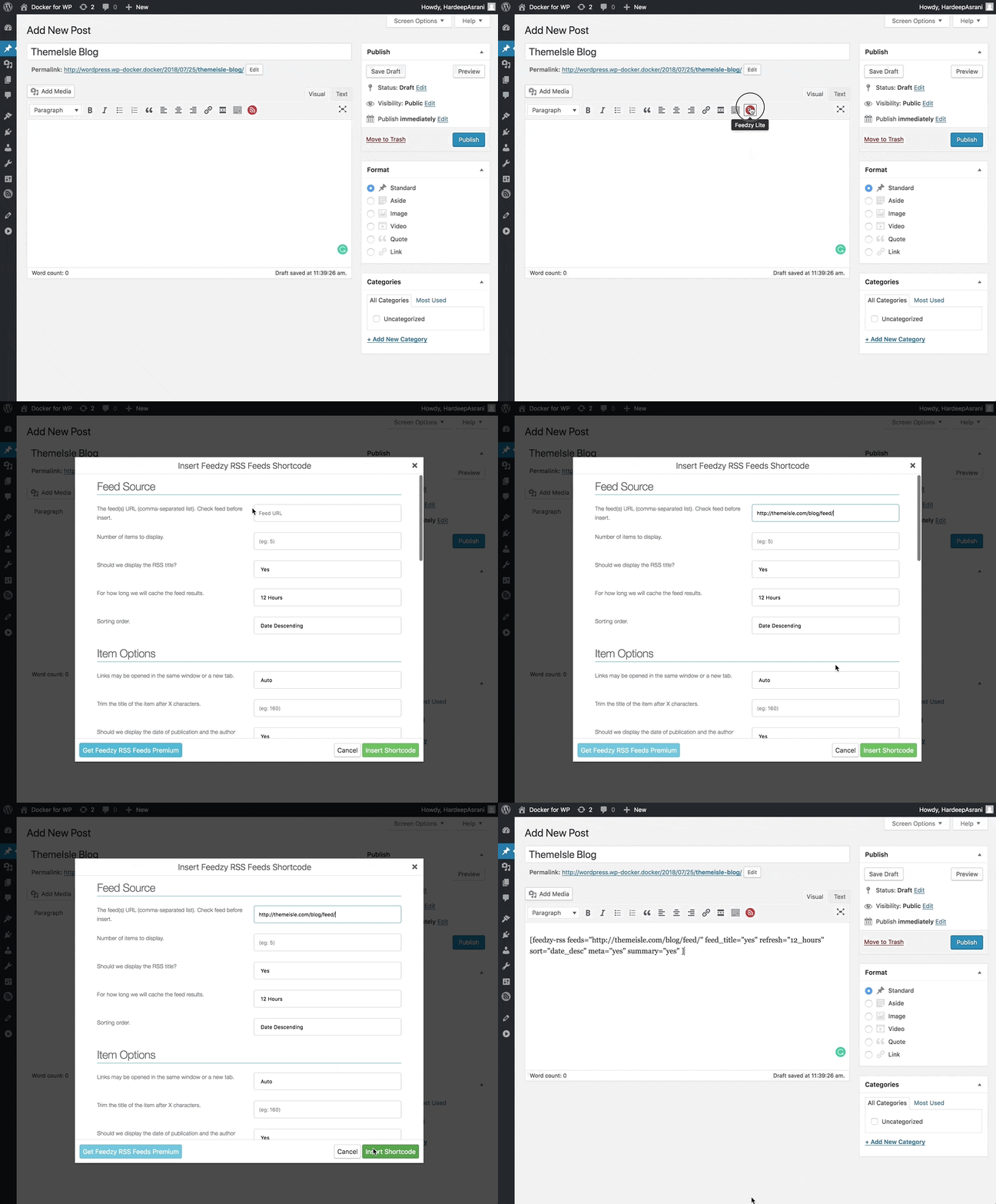
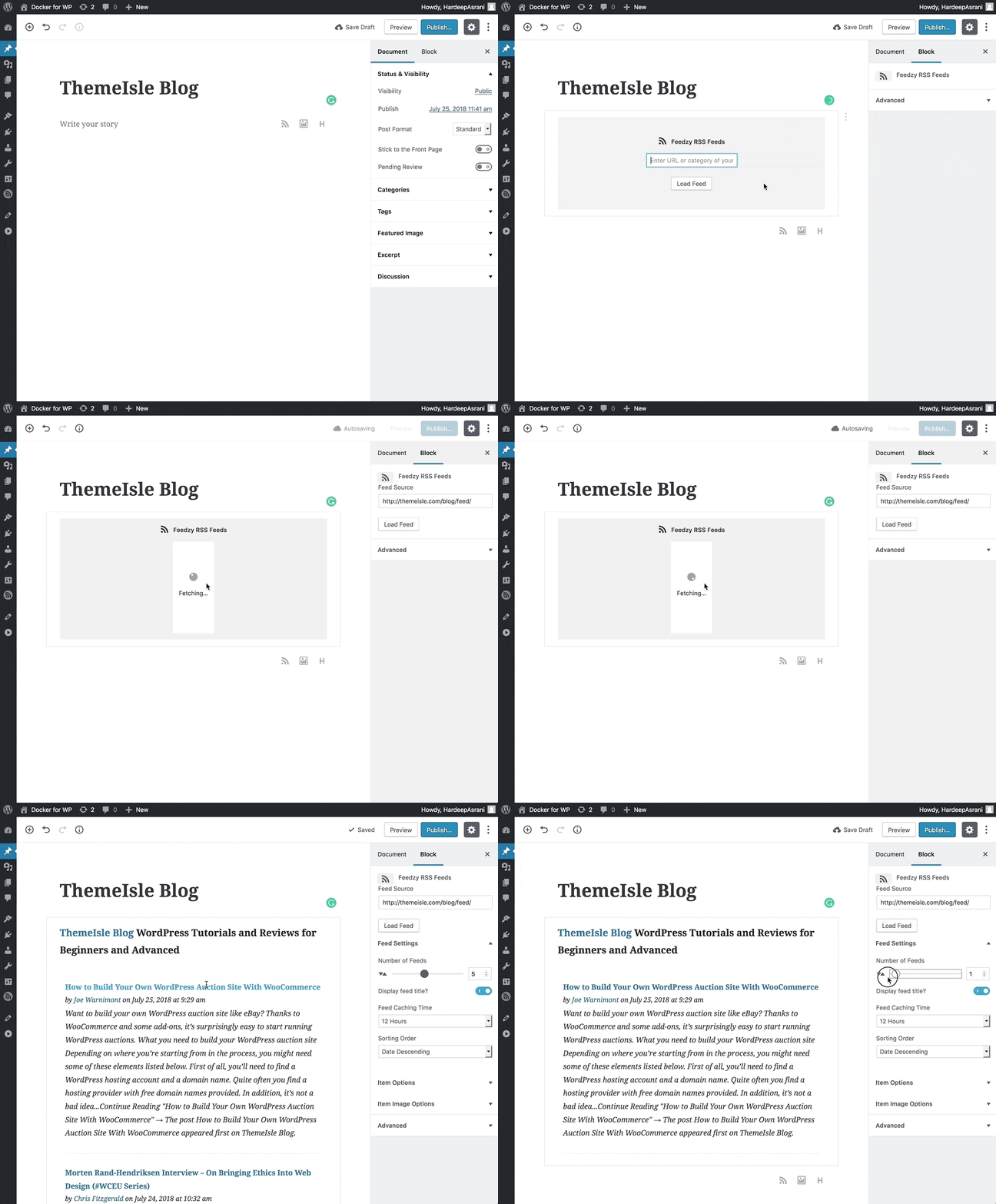
Just to give you an idea, here’s an example of what the user’s standard old-editor experience looks like with a plugin of ours (a), and then what it looks like in Gutenberg (b) – with the plugin optimized for it.
Fear not! We are here to help you with making your plugins Gutenberg-ready. There are many ways to integrate your plugin towards Gutenberg, depending on how your plugin works, which we are going to be discussing in this article.
How to adapt your plugin for Gutenberg
Gutenberg’s API provides us with many ways to extend the editor, like Block API, Shortcode API, and more. Which API to use depends on what type of plugin we are building.
If your plugin is a simple shortcode plugin, then Block API can be used to make a beautiful block for the editor. But if your plugin uses complex metaboxes where a block isn’t enough, we can use Sidebar API.
Also, we will be using a modern stack of JavaScript development tools, such as NodeJS, NPM, webpack, and ESNext. We will be providing you with example files, so you don’t need to worry about setting up your development environment.
In this post, we will be looking at how to make your plugin Gutenberg-compatible by using the Block API. We’ll get into the other methods (Sidebar API, Publish Panel, Status Bar & similar APIs) in part two if needed.
You can find all the mentioned examples in this GitHub repository.
Gutenberg development environment
Developing for Gutenberg requires you to setup bunch of tools, such as NPM, webpack, Babel, and JSX. It takes a lot of time and effort, so we have prepared the environment for you.
Gutenberg Boilerplate is a plugin with minimal Gutenberg development setup and examples. It contains one block and sidebar example. You can use this to extend into your custom block.

You can fork or clone Gutenberg Boilerplate repository to your /wp-content/plugins/ and use it as your development environment.
After that, you need to install NodeJS to your machine to get started. Navigate to Gutenberg Boilerplate folder, and run npm install
From this point on, you need to know three commands that you will be using during the development process:
npm install– Install project dependencies when you clone the project.npm run dev– Compile code during the development process. You need to run this once, and it will keep watching for the changes.npm run build– Compile code for an optimized build once development process is finished.
Block API
Blocks are the fundamental element of Gutenberg, it being a block-based editor. Block API allows you to make blocks for Gutenberg. You can make blocks that can render basic HTML, shortcodes, or even make dynamic blocks to display, for example, your latest posts.
The process based on an existing plugin
In our example, we will adopt a Click to Tweet shortcode to a Gutenberg block. This Click to Tweet shortcode renders a Tweet Box with your text, and a button to tweet that text. Like this:

Our shortcode looks something like this:
[clicktotweet tweet="Text to be displayed" tweetsent="Text to be tweeted" button="Tweet" theme="click-to-tweet"]
Our shortcode has four parameters:
tweet: Text that appears on your site.tweetsent: Text that goes to Twitter.button: Tweet button text.theme: Eitherclick-to-tweetorclick-to-tweet-altas box theme.
Adapting plugins for Gutenberg with Block API
There are two ways of going about it with Gutenberg, either we can render the HTML to the front-end, or we can use our Gutenberg block to render the shortcode to front-end. For this article, we will be doing the latter.
All the code is available in Hello Gutenberg plugin repository on GitHub. You can clone the repository to see the plugin in action, or to modify the code.
Enqueue scripts/styles for Gutenberg
First, we need to enqueue our scripts and styles to Gutenberg editor using enqueue_block_assets:
/**
 * Enqueue front end and editor JavaScript and CSS
 */
function hello_gutenberg_scripts() {
  $blockPath = '/dist/block.js';
  $stylePath = '/dist/block.css';

  // Enqueue the bundled block JS file
  wp_enqueue_script(
    'hello-gutenberg-block-js',
    plugins_url( $blockPath, __FILE__ ),
    [ 'wp-i18n', 'wp-blocks', 'wp-editor', 'wp-components' ],
    filemtime( plugin_dir_path(__FILE__) . $blockPath )
  );

  // Enqueue frontend and editor block styles
  wp_enqueue_style(
    'hello-gutenberg-block-css',
    plugins_url( $stylePath, __FILE__ ),
    '',
    filemtime( plugin_dir_path(__FILE__) . $stylePath )
  );

}

// Hook scripts function into block editor hook
add_action( 'enqueue_block_assets', 'hello_gutenberg_scripts' );
We have added four dependencies to our script that we will be using in our block. Let’s learn about these dependencies first:
wp-i18n is Gutenberg’s version of internationalization functions, such as __(). wp-blocks is used for the registerBlockType function which registers your block. We use wp-editor and wp-components scripts for various components in our block.
Now that we have enqueued your assets, we can start writing our block in /src/block.js file.
Importing dependencies
If you are using Gutenberg Boilerplate then your block.js file should have a basic block structure that you can use to build plugins for Gutenberg:
/**
 * Internal block libraries
 */
const { __ } = wp.i18n;

const { registerBlockType } = wp.blocks;

/**
 * Register block
 */
export default registerBlockType( 'gutenberg-boilerplate/block', {
  // Block Title
  title: __( 'Gutenberg Boilerplate' ),
  // Block Description
  description: __( 'An example block.' ),
  // Block Category
  category: 'common',
  // Block Icon
  icon: 'admin-site',
  // Block Keywords
  keywords: [
    __( 'Boilerplate' ),
    __( 'Hello World' ),
    __( 'Example' ),
  ],
  attributes: {
  },
  // Defining the edit interface
  edit: props => {
    return (
      <h2>{ __( 'Hello Backend' ) }</h2>
    );
  },
  // Defining the front-end interface
  save: props => {
    return (
      <h2>{ __( 'Hello Frontend' ) }</h2>
    );
  },
});
You can run npm run dev to start compiling our code in real time.
First, we will import all the components and libraries that we need for the block on the top:
/**
 * Block dependencies
 */

import classnames from 'classnames';

/**
 * Internal block libraries
 */
const { __ } = wp.i18n;

const { registerBlockType } = wp.blocks;

const {
  RichText,
  InspectorControls,
  BlockControls,
} = wp.editor;

const {
  PanelBody,
  TextareaControl,
  TextControl,
  Dashicon,
  Toolbar,
  Button,
  Tooltip,
} = wp.components;
The first imports classnames which we installed using npm to use multiple classes in our code, as JSX doesn’t allow multiple classes in elements.
We will learn about other components that we have imported as we use them.
Define attributes
Now we will define four attributes for our Gutenberg block, same as our shortcode:
attributes: {
  tweet: {
    type: 'string',
  },
  tweetsent: {
    type: 'string',
  },
  button: {
    type: 'string',
    default: __( 'Tweet' ),
  },
  theme: {
    type: 'boolean',
    default: false,
  },
},
As you can see, all the attributes are same as our shortcode. All attributes have a type key, which tells Gutenberg its data type. You can use string, number, boolean & object as accepted types.
Some of the attributes also contain a default value. Attributes can also have other properties, such as source and selectors, which we won’t be using in our example, but you can learn more about them here.
Edit interface
Now we will be building the edit interface of our block, which will be the display – users will see it while editing the block in Gutenberg.
To get a basic idea, we can first hard-code our block and build upon it by replacing the following area in our code:
// Defining the edit interface
edit: props => {
  return (
    <h2>{ __( 'Hello Backend' ) }</h2>
  );
},
With the following code:
// Defining the edit interface
edit: props => {
  return [
    <div className={ props.className }>
      <div className="click-to-tweet">
        <div className="ctt-text">Pumpkins and Penguins</div>
        <p><a href="https://twitter.com/intent/tweet?text=Pumpkins%20and%20Penguins" className="ctt-btn">Tweet</a></p>
      </div>
    </div>
  ];
},
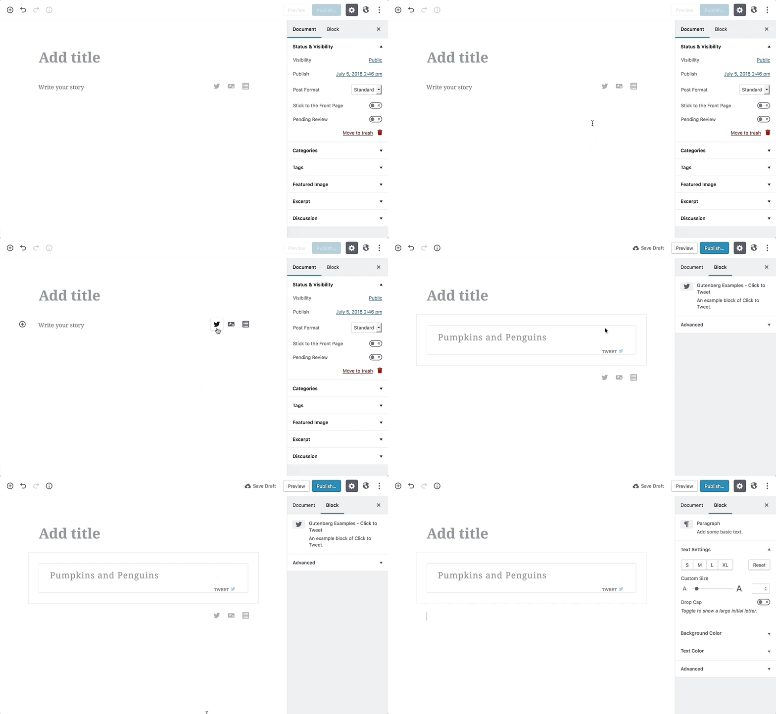
This should give you an idea of our end result. It will look something like this:
The first element of the block is the tweet text area. We will replace it with an editable text field, similar to Gutenberg’s heading block.
We will use RichText component that we previously imported to replace our hard-coded text.
<div className="ctt-text">
  <RichText
    format="string"
    formattingControls={ [] }
    placeholder={ __( 'Tweet, tweet!' ) }
    onChange={ onChangeTweet }
    value={ props.attributes.tweet }
  />
</div>
Our RichText component has five arguments. format is a string, as we are going to use our shortcode to display the elements in the front-end. If we wanted to use a selector in our attribute, then format would have been an array.
RichText has some formatting options by default, like bold and italic, which we have disabled by passing an empty array in formattingControls argument.
placeholder is the placeholder text when there is no text in the field, and onChange will trigger onChangeTweet function when a change event takes place.
Finally, value will be the value of our field, which will be taken from tweet attribute that we defined earlier.
Once that we have defined our RichText area, we need to build onChangeTweet function which will trigger when value changes in our text field.
// Defining the edit interface
edit: props => {
  const onChangeTweet = value => {
    props.setAttributes( { tweet: value } );
  };
  return [
  ...rest of the code
We pass value of RichText field to onChangeTweet function, which uses props.setAttributes function to update the value of tweet attribute.
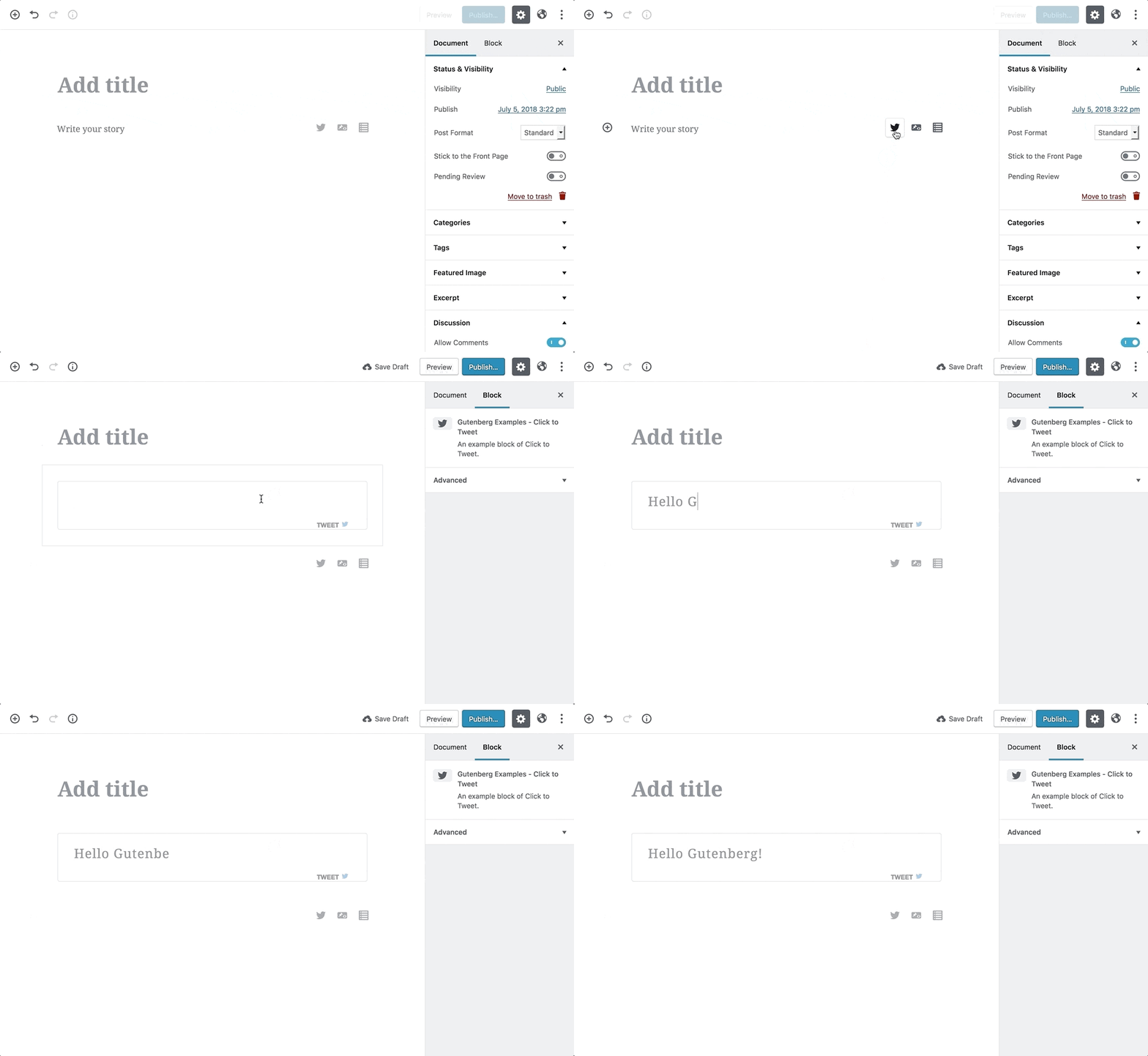
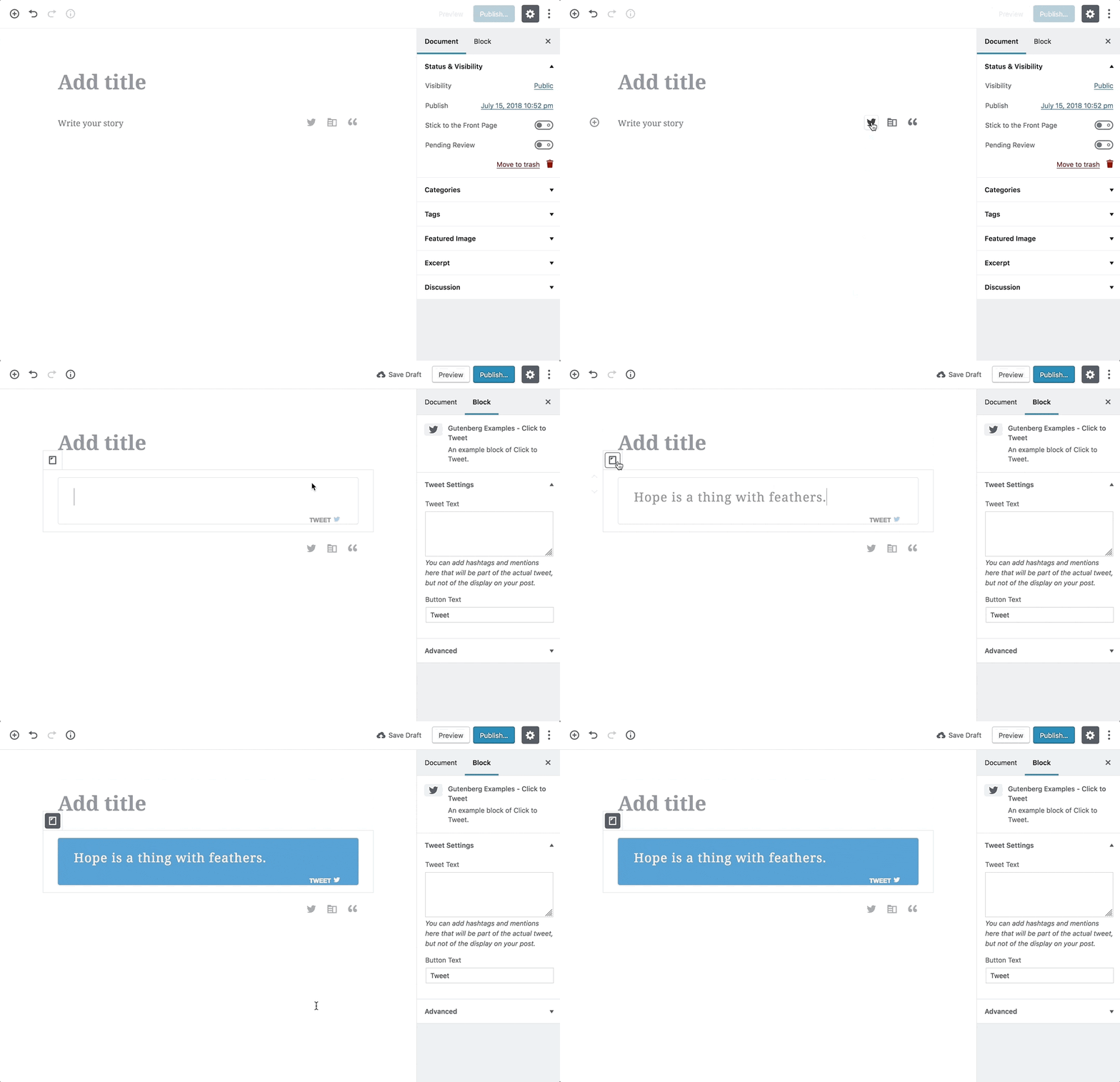
You will see the power of Gutenberg now when you use your block.
Isn’t it awesome?
Block Inspector
When building plugins for Gutenberg, you don’t need to reinvent the wheel every time to make option panels for your plugins. Gutenberg provides us with a simplified way to allow block customization and ensures that every user has a consistent experience with built-in UI patterns.
Similarly to RichText component, InspectorControls component adds a sidebar when the block is selected. Something like this:

We will also be using TextareaControl and TextControl to add a textarea and text input field to our Inspector area.
We will be adding the following code to your return statement:
!! props.isSelected && (
  <InspectorControls key="inspector">
    <PanelBody title={ __( 'Tweet Settings' ) } >
      <TextareaControl
        label={ __( 'Tweet Text' ) }
        value={ props.attributes.tweetsent }
        onChange={ onChangeTweetSent }
        help={ __( 'You can add hashtags and mentions here that will be part of the actual tweet, but not of the display on your post.' ) }
      />
      <TextControl
        label={ __( 'Button Text' ) }
        value={ props.attributes.button }
        onChange={ onChangeButton }
      />
    </PanelBody>
  </InspectorControls>
),
props.isSelected checks to make sure that the Inspector only appears when the block is selected.
TextareaControl and TextControl components, similarly to RichText, have a value and onChange method.
We also need to change the code of your block display to accommodate new changes. In our case, we only need to add Button Text to our block as Tweet Text will be added to the link, so we don’t need to show it in our backend.
You can replace hyperlink in our initial code with the following:
<a className="ctt-btn">
  { props.attributes.button }
</a>
As mentioned before, we are removing hyperlink from our code because we don’t need to show it in the backend. This will make our block look like so:

Block Inspector can be a potent tool for your block. If your plugin has advanced options that are too complicated for editor area, then you can put them in the Inspector area.
We will add one last option to our block to finish the JavaScript part in the next section.
Block Toolbar
Block Toolbar is another pre-built UI component that we can use to add more options to our block. It will appear above your block when you select it. Example:

Ideally, Block Toolbar should contain the primary controls of your block, with Inspector hosting the secondary controls. However, that is debatable and depends on your block.
We will be using the Block Toolbar area to host our alternative style control.
Similar to Block Inspector, we need to add the following code to our return statement to add Block Toolbar to our block:
!! props.isSelected && (
  <BlockControls key="custom-controls">
    <Toolbar
      className='components-toolbar'
    >
      <Tooltip text={ __( 'Alternative Design' ) }>
        <Button
          className={ classnames(
            'components-icon-button',
            'components-toolbar__control',
            { 'is-active': props.attributes.theme },
          ) }
          onClick={ toggletheme }
        >
          <Dashicon icon="tablet" />
        </Button>
      </Tooltip>
    </Toolbar>
  </BlockControls>
),
We use BlockControls and Toolbar components to add a toolbar to our block. Similar to Block Inspector, props.isSelected makes sure our toolbar only appears when we put focus on our block.
We also use Tooltip and Button components for our control. Tooltip component is wrapped around Button component to make sure there’s a tooltip when you hover over the control to give you more context.
Button component is using classnames module that we imported earlier in the article. We used classnames function to give three classes to our control. The third class, is-active, only appears when our theme attribute value is true.
Its onChange function toggles the theme attribute to true/false. In the end, Dashicon components is used to display an icon for our control.
We will also have to change our block code for it to work with the changes. We need to replace the following line:
<div className="click-to-tweet">
With:
<div className={ ( props.attributes.theme ? 'click-to-tweet-alt' : 'click-to-tweet' ) }>
We are checking if the theme attribute is true or false, and assigning a class to our block accordingly.
Now your block should look something like this:
We have finished the JavaScript-side part of our Gutenberg block. You can find the entire source code of the file here.
Now we will finish our block by handling the server-side output.
Server-side rendering
Gutenberg allows you to use server-side rendering to show your blocks on the front-end. That server-side rendering makes it possible for us to create blocks for shortcodes.
First, we will make our save method to return null by replacing it with the following code:
// Defining the front-end interface
save() {
  // Rendering in PHP
  return null;
},
We will use register_block_type PHP function to register our block type in PHP:
if ( function_exists( 'register_block_type' ) ) {
  // Hook server side rendering into render callback
  register_block_type(
    'hello-gutenberg/click-to-tweet', [
      'render_callback' => 'hello_gutenberg_block_callback',
      'attributes'    => array(
        'tweet'  => array(
          'type' => 'string',
        ),
        'tweetsent' => array(
          'type' => 'string',
        ),
        'button'  => array(
          'type'  => 'string',
          'default' => 'Tweet',
        ),
        'theme'  => array(
          'type'  => 'boolean',
          'default' => false,
        ),
      ),
    ]
  );
}
Our register_block_type function. We first pass our block name to it, along with an array of arguments.
The first argument is the render_callback function, which calls to our hello_gutenberg_block_callback function for server-side rendering.
After our render callback, we pass attributes as an array, similar to block.js file, which we use in our render callback function.
Our render callback function looks like this:
function hello_gutenberg_block_callback( $attr ) {
  extract( $attr );
  if ( isset( $tweet ) ) {
        $theme = ( $theme === true ? 'click-to-tweet-alt' : 'click-to-tweet' );
    $shortcode_string = '[clicktotweet tweet="%s" tweetsent="%s" button="%s" theme="%s"]';
        return sprintf( $shortcode_string, $tweet, $tweetsent, $button, $theme );
  }
}
We extract all the attributes and then return it inside our shortcode. That is all it takes to adapt your shortcode plugins for Gutenberg.
You can find all the code used in this article in this hello-gutenberg repository.
In the next part, we will take a look at others ways to adapt existing plugins for Gutenberg, including the Sidebar API.Further reading:
- A Gutenberg Tutorial for Beginner Developers
- Making a “Plugin Options Page” With Gutenberg Components
- Fetch API for beginners
- Google Maps JavaScript API
Check out our other API tutorials:
If you have any questions on how to adapt your plugin for Gutenberg, please ask them in the comments!
…
Don’t forget to join our crash course on speeding up your WordPress site. Learn more below:
How to Speed Up Your WordPress Site
With some simple fixes, you can reduce your loading times by even 50-80% 🚀
By entering your email above, you're subscribing to our weekly newsletter. You can change your mind at any time. We respect your inbox and privacy.



I think this sentence is using the wrong word: “Now that we have enqueued your asses, we can start writing our block in /src/block.js file.”
“… assets…” may work better.
That was stupid. Thanks for the correction, we’ve edited it. Hope you like the article. 🙂